Tag Archives: design

This re-imagined jersey proves that maybe the Browns logo isn’t so bad after all

After the Browns huge logo “reveal” on Tuesday I’m sure we were all left feeling like this

wtf animated GIF

All that hype for a different shade of orange and a different color facemask. It was quite the letdown. People were mad. People were sad. The entire nation laughed at us (nothing new there but whatever)

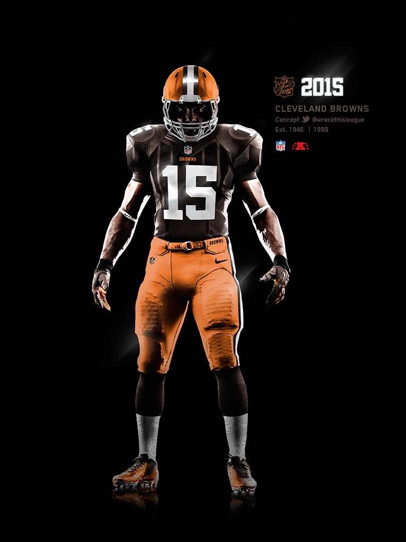
But fear not, I’m here to show you the light. To talk you down from that proverbial ledge. To show you that there’s still hope with the new Browns uniforms being revealed on April 14th. And that hope comes via @WreckThisLeague and his concept uniform that takes the new logo & shade of orange into account. Scroll down….

WARNING: It’s beautiful

wreckthisleagueconcept

Fuck. Yes. And that my friends is what an NFL uniform should look like. Still traditional enough for the purists but also eye popping enough for the younger generation. Love the dog logo on the pants too which I didn’t know was possible.

You can see that the above version really does look better with the new orange than the old version of orange.

Embedded image permalink

Hopefully the Browns are perusing the Internet because there have been some fantastic uniform concepts out there. They can’t blow this, can they?

With rumors of a Browns new uniform release swirling, here are all the concepts floating around

There’s a rumor floating around these here interwebs that the Browns may be releasing their new uniforms soon. Some say it’s February 16, some says it’s February 18th, but no one really has any idea. We gathered all the uniform concepts floating around Twitter etc. and rated them. Some are good, some are pretty bad. I imagine that whatever the Browns and Nike come up with, they’ll resemble something in this gallery

UPDATE: Those dates are obviously completely wrong

. If you know of any that aren’t on here, tweet us @Bottlegate

Note: None of these pictures were made by anyone from Bottlegate.com nor do they belong to us. If you see your design up there, let us know and we’ll give you your deserved credit

The Jetsons come to Cleveland; first drafts of the nuCLEus have been released

From Cleveland.com

CLEVELAND, Ohio, – A residential tower at the nuCLEus project in downtown Cleveland could stand 54 stories– or 647 feet– high, making it the city’s fourth tallest building.

The developers behind the skyline changing nuCLEus proposal filed their first crop of renderings with the city Thursday. The images show how Stark Enterprises of Cleveland and J-Dek Investments Ltd. of Solon hope to fit apartments, offices, stores, restaurants, hotel rooms, parking garages and — possibly — a few dozen condominiums onto a 3-acre site in the Gateway District.

J-Dek and Stark also confirmed that they’ve hired NBBJ as the lead architect on the project, which now carries an estimated price tag of $380 million to $400 million.Bialosky + Partners Architects, a local firm, will assist NBBJ designers from Columbus, New York and Shanghai.


Well holy shit. Is this Cleveland or is this the Capitol of Panem? I’m almost expecting President Snow to come buzzing out of a window in a hovercraft on the way to the ceremony to begin the 75th Hunger Games (aka the Third Quarter Quell for you n00bs out there)

Judging by the fine, eloquent, poignant commenters from the Cleveland.com article you’d think this was the worst piece of architecture ever drawn in the world:

clecomment1Let’s take a look at Toronto’s skyline as “quinnanderson” said:

Looks pretty nice to me

clecomment2


FLAMING SCORCHING HOT TAKE here from Ohiodood

clecomment4


the_truth bringing it strong

clecomment5


Typical Cleveland attitude

clecomment6


But here’s my favorite:

clecomment3burn

Hey wakeupcle, you just got BURNED, bro!

It’s utopian as fuck and futuristic. I personally love it. This is only the first draft so there’ll be a lot more rendering and designs. I’m excited to see what the final design looks like.